
A forecast of the biggest web design and development trends for 2019
Before we dive in, it’s critical to know the difference between a passing fad and an industry trend. For example, a website that looks “cool” today could look outdated and unfashionable in as little as a few months. With a focus on trends rather than fads, your website design can look great for several years rather than falling by the wayside with an outdated look.
Web development trends in 2019 will have a primary focus on the user experience (UX). Priorities will include mobile and responsive design, page speed, engaging designs moving towards asymmetrical layouts, micro animations, and video backgrounds.
Let’s have a look at the top web design and development trends for 2019:
1. Mobile and Responsive Design
For 2019, mobile or responsive website design will be a must-have rather than a nice-to-have. In 2015, 35% of website traffic was served to mobile devices. In 2016, that increased tos 43%. In 2017, 50.3%. And now in 2018, mobile devices are expected to reach 79% of global internet use by the end of the year.
In 2018, Google officially released its mobile-first indexing. Mobile-first indexing is exactly what it sounds like: the mobile version of your website becomes the starting point for what Google includes in their index, and the baseline for how they determine rankings – including your desktop ranking.
In essence, mobile websites have officially become the benchmark for your overall site rankings.
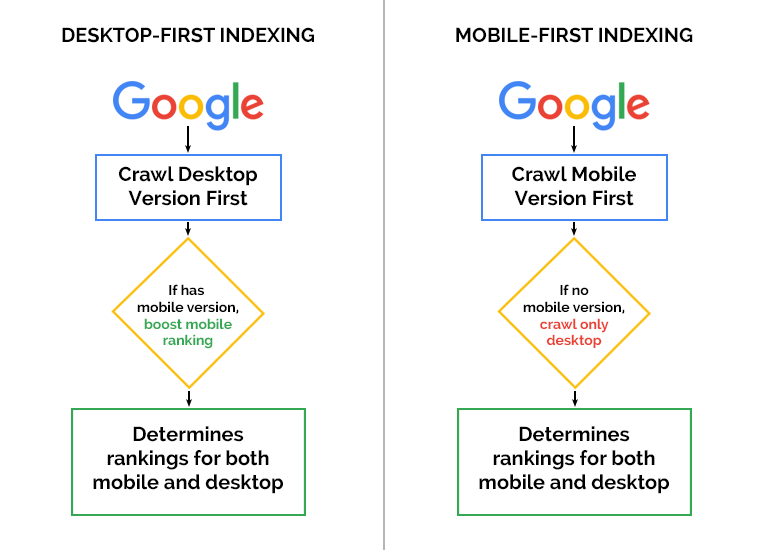
As you can see, with the old desktop-first indexing, a site with a mobile version would get a boost…and with the new mobile-first indexing, a site will now go down in rankings if a mobile version is not available.
So what do you need to do in order to be ready for mobile-first indexing?
If you already have a mobile or responsive website, you’ll be happy to know that you’re in the clear. For those who do not have a responsive or mobile website, you need to get on board if you want to compete in today’s online market. Contact us for more information.
2. Design For Mobile First
It’s not coming, it’s happened. Mobile devices are now more popular than desktop computers, so it’s little wonder that mobile-first design is now the trend. Mobile-first web design changes the fundamental way in which websites are developed.
The old standard was to design a website for desktop or laptop computer display, and then to add a mobile-friendly or mobile responsive design to that. Mobile-first design, on the other hand, does the opposite: first the mobile site is designed and then the desktop or laptop version.
The drive towards mobile-first design is not only about ranking factors or SEO considerations. The primary goal is to enhance and optimize the website visitor’s user experience(UX) based on the device they’d be most likely to be searching from.
3. Flat Design
Since 2017, website designers and developers focused on creating clean and simple designs for better mobile performance and an enhanced user experience (UX).
According to Wikipedia, “flat design is a style of interface design emphasizing minimum use of stylistic elements that give the illusion of three dimensions (such as the use of drop shadows, gradients or textures) and is focused on a minimalist use of simple elements, typography and flat colors” (Cited Source https://en.wikipedia.org/wiki/Flat_design ).
So what does that mean? Are we limited to only 2 dimensions now? Let’s have a look:
First of all, flat design does not mean everything is reduced to two dimensions. It’s more about usability with a minimalist approach. The goal is to get rid of clutter and focus on the important elements of your website.
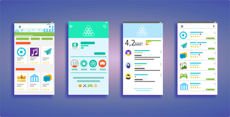
Here are some simple examples of flat designs set in a mobile interface:
Slow-loading websites with high resolution image-based designs are making way for fast-loading sites that use clean edges, lots of white space, and bright colours to stimulate and captivate the user’s attention.
Make sure you consider your target audience, however, because research has shown that flat design is more popular with young adults than older adults.
4. Asymmetrical UI Design
While the pure definition of asymmetry is having parts that fail to correspond to one another in shape, size, or arrangement, an important part of asymmetrical design is to maintain balance. In fact, when it’s done right, a well balanced asymmetrical design is more interesting and can be a powerful attention-grabbing technique.
With asymmetrical design, the visual “weight” on each side of the screen would be different. For example, a dominant visual element on one side could be balanced with a minimalist element on the other, such as a powerful visual image on one side balanced with a minimal and clean text element.
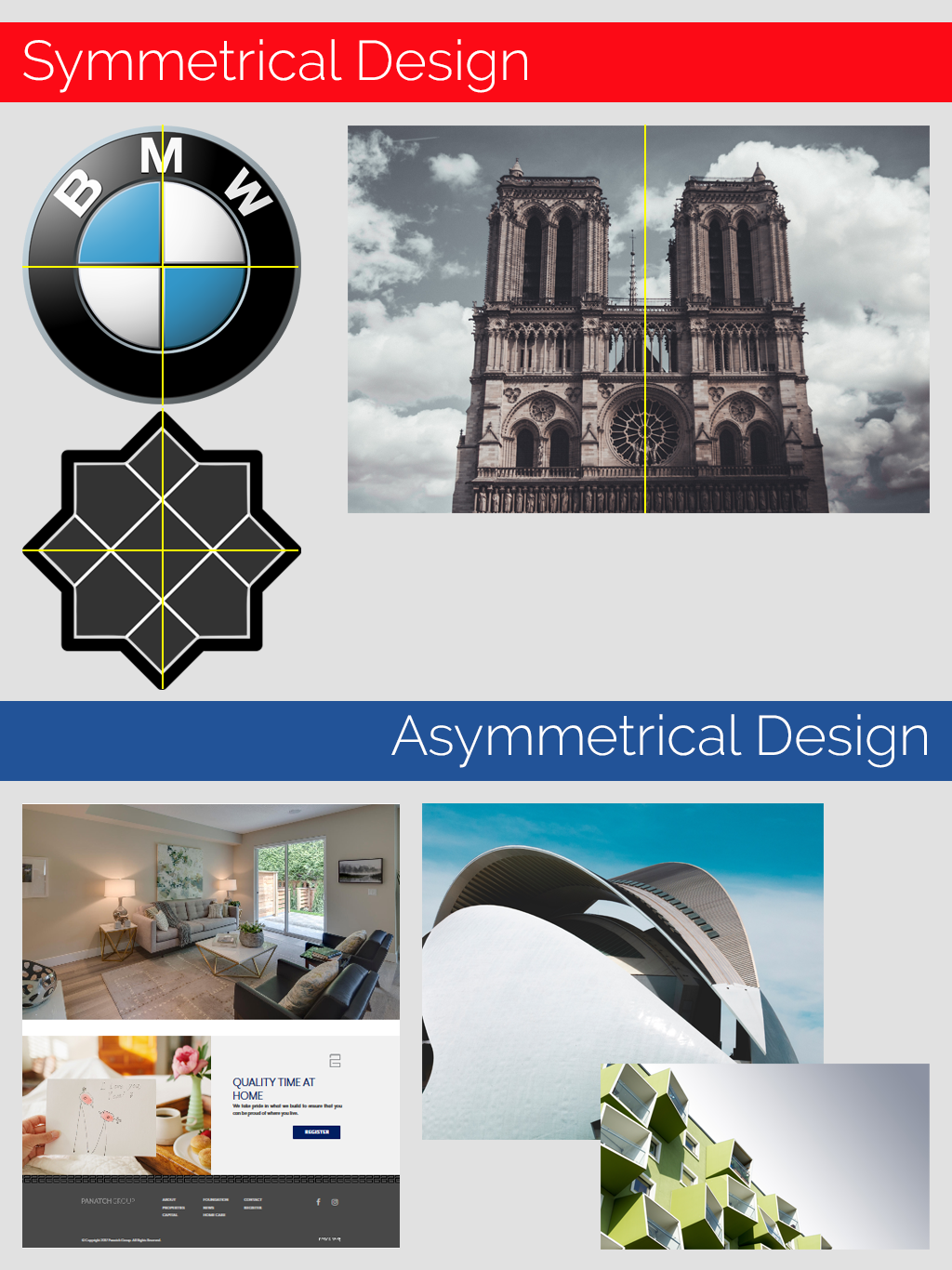
Asymmetrical design is more complex and difficult to acheive, but is pleasing to the eye and offers the viewer more variety. By creating an “informal balance” between design elements, asymmetrical design can be used to draw attention to a specific part of a web page such as a call to action (CTA) that otherwise might have been overlooked.
5. Single Page Design
Traditionally, websites were created with each topic having its own separate page. For many sites, this makes perfect sense as it allows the content to be grouped in logical chunks. However, the way people view websites has been evolving over the years to the point where more people access the web on mobile devices than on computers.
With this rise in mobile browsing, many websites are moving towards single page design, which allows mobile users to easily scroll through the content.
Minimalist design and fast load times are trends that will not go away anytime soon. Because single page sites are quick to load on mobile devices, they are favoured by search engines over multi-page sites…and they are convenient for site visitors – a true win-win situation.
6. Page Load Time
You only have a few seconds to capture your site visitors’ attention. In those few seconds, you want to be sure you clearly identify what your website is about, and offer your visitors a call to action. Because of this, you page speed – or page load time – needs to be as fast as possible.
The last thing you want to do is keep your site visitors waiting while your page is loading. They will quickly lose interest and go somewhere else. Additionally, the Google Speed Update went into effect in July 2018, which means that Google has begun boosting rankings for faster loading sites.
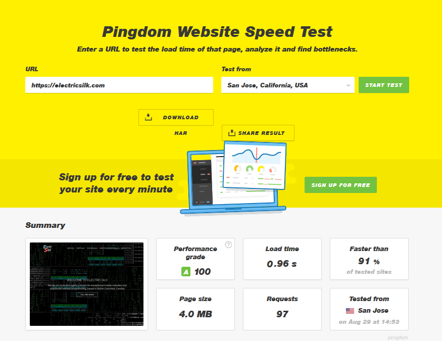
The bottom line is that fast-loading websites are a must. Since there is only so much a developer can do to speed up a web page, designers need to consider page load time in the site design phase. This is not to suggest that large photos or videos cannot be incorporated, but rather they must be incorporated in such a way as to not slow down the site.
7. Micro Animations (Goodbye Flash)
You only have a few seconds to capture your site visitors’ attention. In those few seconds, you want to be sure you clearly identify what your website is about, and offer your visitors a call to action. Because of this, you page speed – or page load time – needs to be as fast as possible.
The last thing you want to do is keep your site visitors waiting while your page is loading. They will quickly lose interest and go somewhere else. Additionally, the Google Speed Update went into effect in July 2018, which means that Google has begun boosting rankings for faster loading sites.

Keep in mind that although animation can be a great addition for some sites, it’s not suitable for every application. Try to avoid using effects for effects sake, and make sure the main reason for using animation is to improve your user experience. If you’re not sure of the purpose of the animation, the old rule still applies today: when in doubt, leave it out.
Oh, and Flash…well it’s not supported on most mobile devices so if you have Flash elements on your website, it’s time to update your technology.
8. Videos and Video Backgrounds
Video backgrounds are very compelling and more interesting than static images. Videos can convey complex messages much easier than static images and text, and the message is absorbed much more quickly by the user.
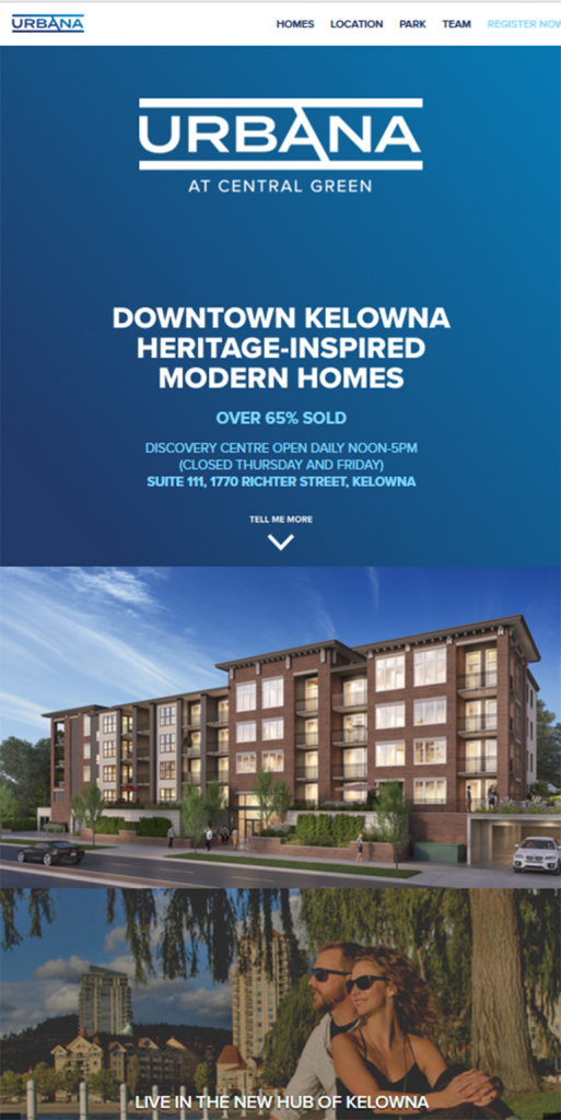
Despite the move to more minimalist websites, video backgrounds and other video elements will still play a significant role in 2019. Simply put, video can do what static elements cannot. For example, with SuzieQ Dance Band what better way to promote their offering than with a video:
Video can be used to help increase brand awareness, stimulate visitor interest, and as an attention-getter. What might take many paragraphs to explain, video can do it in seconds. As long as the video is relevant, fast-loading and high quality, a well placed video can give your site increased appeal.
9. Accelerated Mobile Pages (AMP)
The Accelerated Mobile Pages Project (AMP) is an open-source website publishing technology designed to improve the performance of web content and advertisements led by Google. According to Google, “The project enables the creation of websites and ads that are consistently fast, beautiful and high-performing across devices and distribution platforms”.
Why use accelerated mobile pages? Performance. Google reports that AMP pages served in Google search typically load in less than one second and use 10 times less data than the equivalent non-AMP pages. CNBC reported a 75% decrease in mobile page load time for AMP Pages over non-AMP pages, while Gizmodo reported that AMP pages loaded three times faster than non-AMP pages. Bottom line is that AMP pages load almost instantly.
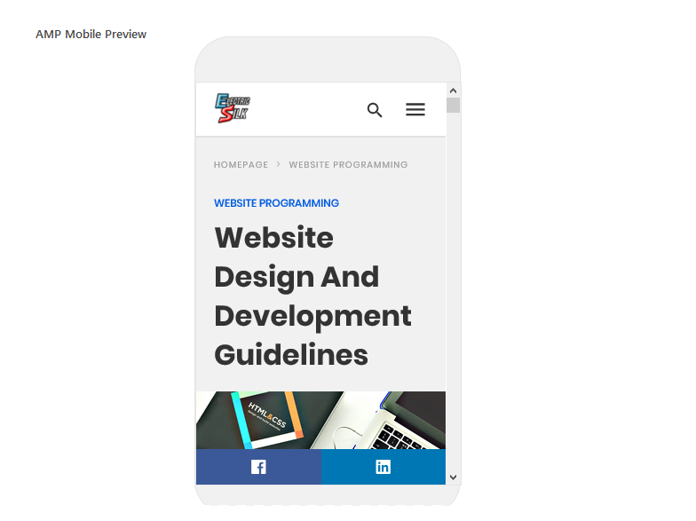
AMP pages are, in essence, stripped down HTML pages designed to be lightweight and fast loading. To accomplish this, “lazy load” is used so images only load when they are scrolled into view. Ultimately, AMP pages will be cached so that Google can host the actual content of your pages without the need to “fetch” from your website.
This technology is still in the early stages of development, but trends indicate it will become more and more mainstream over the next year or two.
10. Progressive Web Apps (PWA)
According to Wiki, “Progressive Web Apps are web applications that load like regular web pages or websites but can offer the user functionality such as working offline, push notifications, and device hardware access traditionally available only to native mobile applications.”
In simpler terms, progressive web apps are standard web apps consisting of regular web pages designed to look like native mobile applications. Unlike traditional apps, progressive web apps load on demand and do not require downloading from an app store.
Among others, both Starbucks and Trivago have highly successful progressive web apps in place:
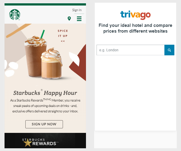
Progressive web apps are not a new technology or framework. Rather, they are a set of best practices to make a web application look and work similar to an actual mobile application. The goal is to create a seamless experience so users won’t know if they’re loading a Progressive Web App or a native mobile app.
Creating and implementing progressive web apps is not a simple task, and a single PWA can take from several weeks to even months to develop.
11. The Future of Customer Service: AI Chatbots
A chatbot is a computer program that allows either a text- or voice-based conversation. Chatbots are typically used to create a dialog with customers as a means of providing information or customer support. Most chatbots are either accessed via virtual assistants such as Amazon Alexa, via messaging apps such as Facebook Messenger, or via individual organizations’ apps and websites.
Because of their effectiveness, chatbots are redefining how organizations are developing their customer service strategies. Imagine the convenience for potential customers accessing your website with a particular question like “is this home still available” or “is there a park nearby”. With a chatbot, they could have instant access to a virtual customer service rep.

Chatbots are still very much on the rise in popularity and usage, and aren’t expected to be mainstream for another year or two. Because of this, now would be the best time to capitalize on this budding technology. Your customers will truly appreciate the increased level of service and easy access to information.
Web Design Trends for 2019 — Minimalism and Engaging Websites
For 2019, the focus of web design is entirely about the user experience. On one hand, we want to take advantage of the visual appeal of asymmetrical layouts, striking imagery and video backgrounds. On the other hand, there is the simplicity of flat design and single page layouts. Finding a balance that works for your target audience is the key.
As changes in trends happen over the Internet, it’s important that your website and the underlying technology stay current with the times…or you risk falling to they wayside behind your competitors.
Oh, and if you think “push notifications” are conspicuous in their absence from this list, stay tuned for my next article that will focus on just that.
If you’d like further information about industry trends, or if you’d like a free consultation, feel free to contact us.